Allegiance
Rebuilding a healthcare member portal by bringing design into the client conversation
Thesis: I helped recover a high-risk client relationship by turning vague dissatisfaction into collaborative design priorities, then translating those priorities into a more modern and reusable healthcare portal direction.
Allegiance was one of Healthx's largest clients. The project began with an out-of-the-box solution that the client initially accepted but later judged unable to meet its needs and expectations. The client was frustrated and was considering taking its business elsewhere, making the redesign both a product challenge and a relationship recovery challenge.
I served as the design lead and one of the front-end developers. For this project, I led the design and direction for the redesign, facilitated parts of the collaborative discovery process, and presented the proposed solution internally and to the client. Another developer coded the homepage dashboards.The turning point was recognizing the original process had skipped a critical step: design had not met directly with the client. I brought together Product, Sales, Project Management, Development, Design, and leadership for collaborative sessions and led the design discovery portion with the client.
The Problem
The initial client feedback was simple but broad: the current solution was not good enough and needed to be better. That statement was emotionally clear but operationally vague. It did not identify which member tasks mattered most, which labels or navigation structures were failing, what data members cared about, or how the portal should express the Allegiance brand.
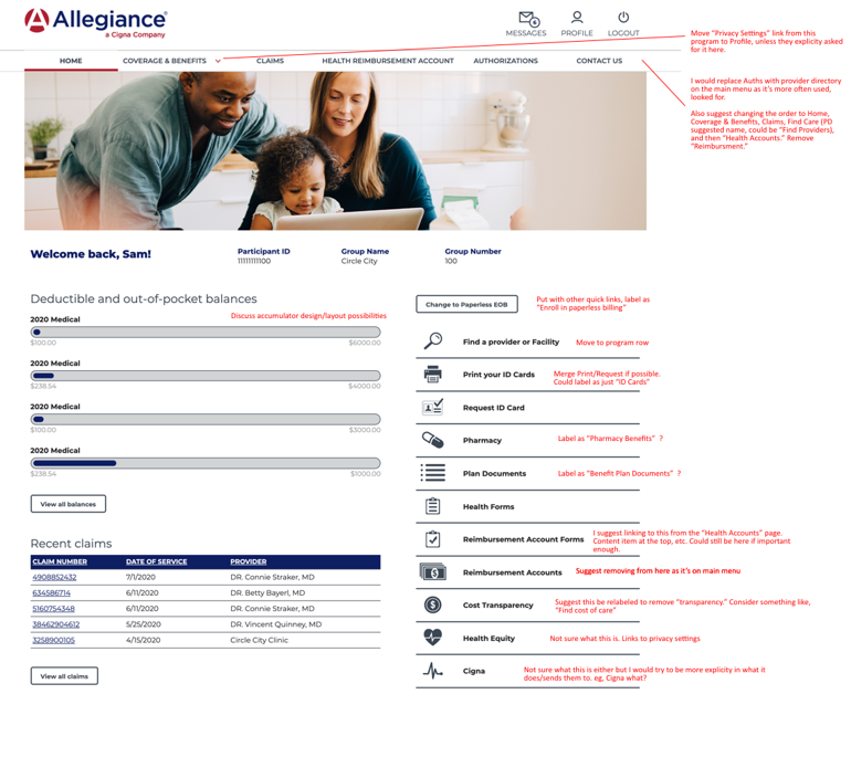
The inherited platform also carried broader out-of -the-box problems. Supporting materials describe excessive spacing, inconsistent styling, generic layouts, poorly contextualized data, and a benefits view that behaved like a data dump rather than a member-oriented explanation. The dashboard similarly showed deductible and out-out-pocket information without enough context to help members understand what they were seeing.
The design problem was therefore twofold: recover a shared understanding of the client's priorities, then work within an established platform to create a more useful, modern, and repeatable portal direction.
The constraint that shaped the work
The project needed to move quickly because the client relationship was at risk. At the same time, the solution could not be designed as an entirely custom product outside of the Healthx platform. The work had to balance client-specific needs with the realities of an established templated system.

The Process
Bringing the missing voices into the room
I arranged a meeting that included Product, Sales, Project Management, Development, Design, leadership and the client. This changed the design problem from a series of secondhand interpretations into a shared conversation. I facilitated portions of the collaborative sessions and led the design discovery discussion.
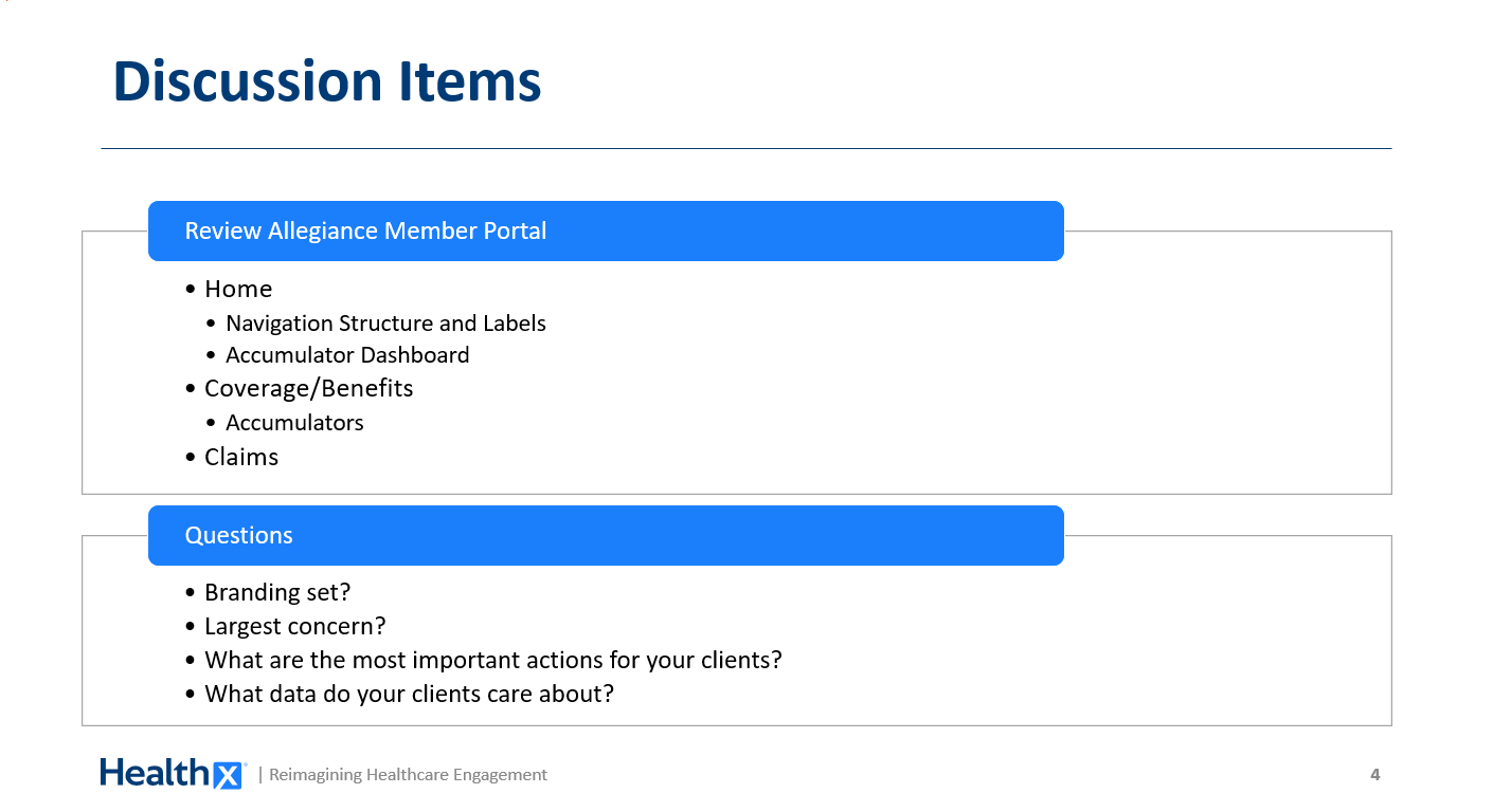
The discovery agenda focused on the parts of the portal most likely to shape member engagement: the home experiences, navigation structure and labels, the accumulator dashboard, coverage and benefits, accumulators, and claims.
Replace vague dissatisfaction with useful questions
The discovery conversation used direct questions to turn "make it better" into design criteria. The documented questions included:
| Discovery Question | Design implication |
|---|---|
| Is the branding set? | Establish whether the visual system should reinforce an existing identity or help define one. |
| What is the largest concern? | Identify the highest-risk experience problem instead of treating every issue as equal. |
| What are the most important actions for your clients? | Prioritize the homepage around member tasks rather than internal data structures. |
| What data do your clients care about? | Decide what information deserves prominence and what can remain secondary. |
This was the point at which the work became more than a visual redesign. The team was aligning the product around member priorities, language, and action.
Explore multiple layout directions
We developed three new layout directions that could work within the established platform. I contributed to the design and direction of the homepage dashboards, while broader team evaluated how the concepts could support client expectations and implementation realities.
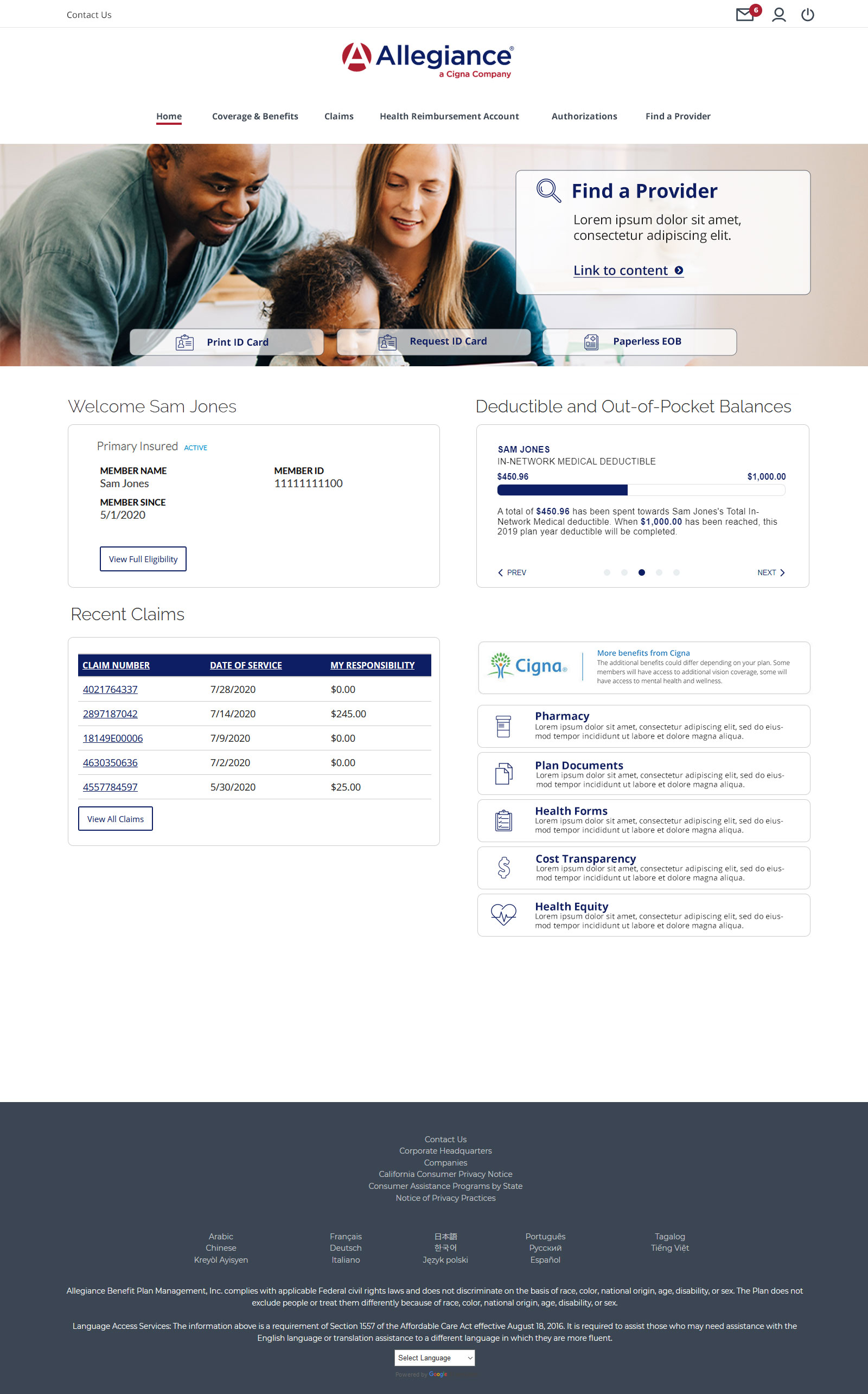
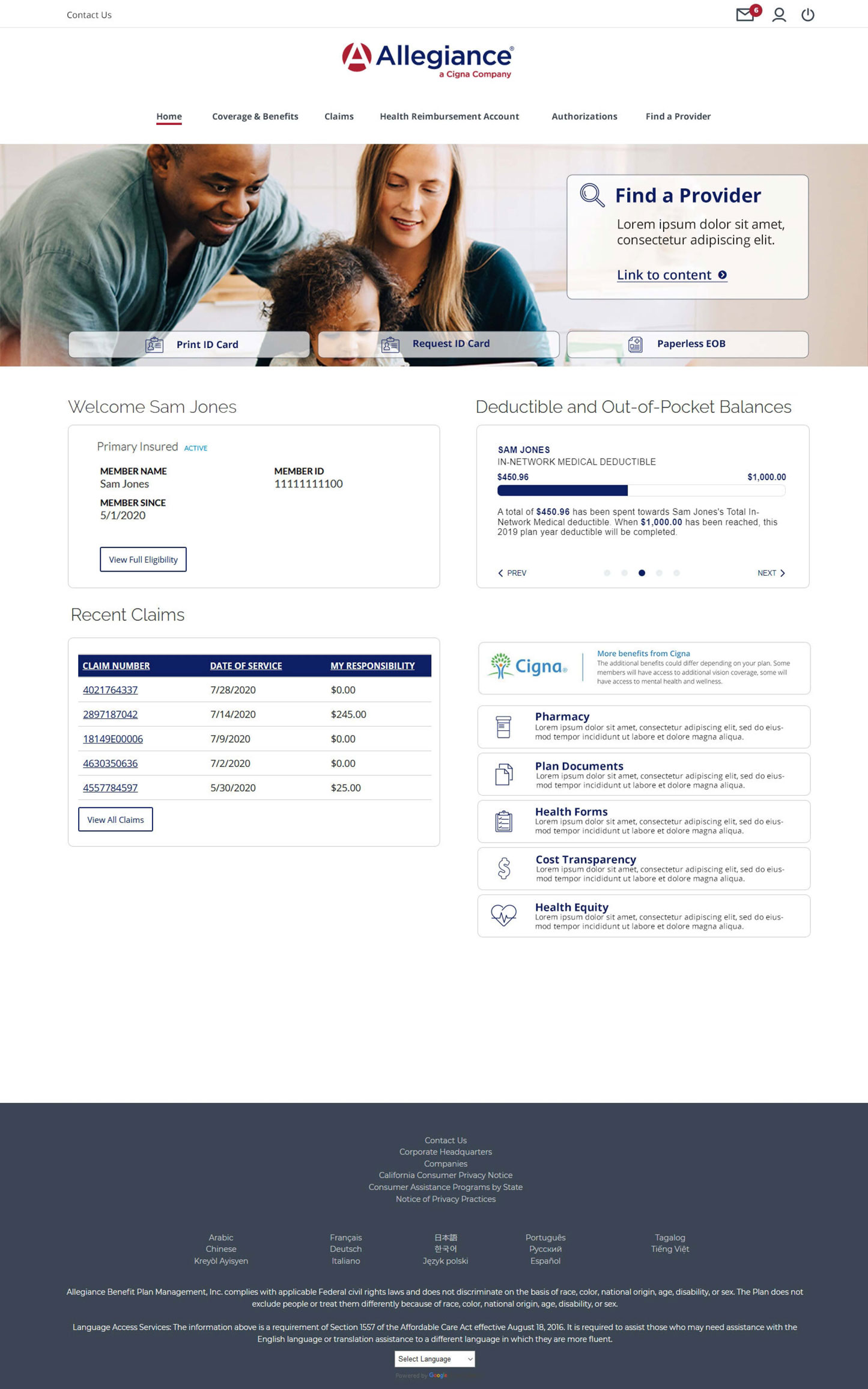
The proposed designs make common member actions more visible. Examples shown in the source materials include finding a provider, finding a medication, viewing claims, viewing referrals and authorizations, accessing benefit documents, viewing prescription benefits, and replacing an ID card. Other screens foregrounded actions such as viewing summary of benefits, viewing pan documents, changing primary care provider, and printing an ID card.
Contextulize the data
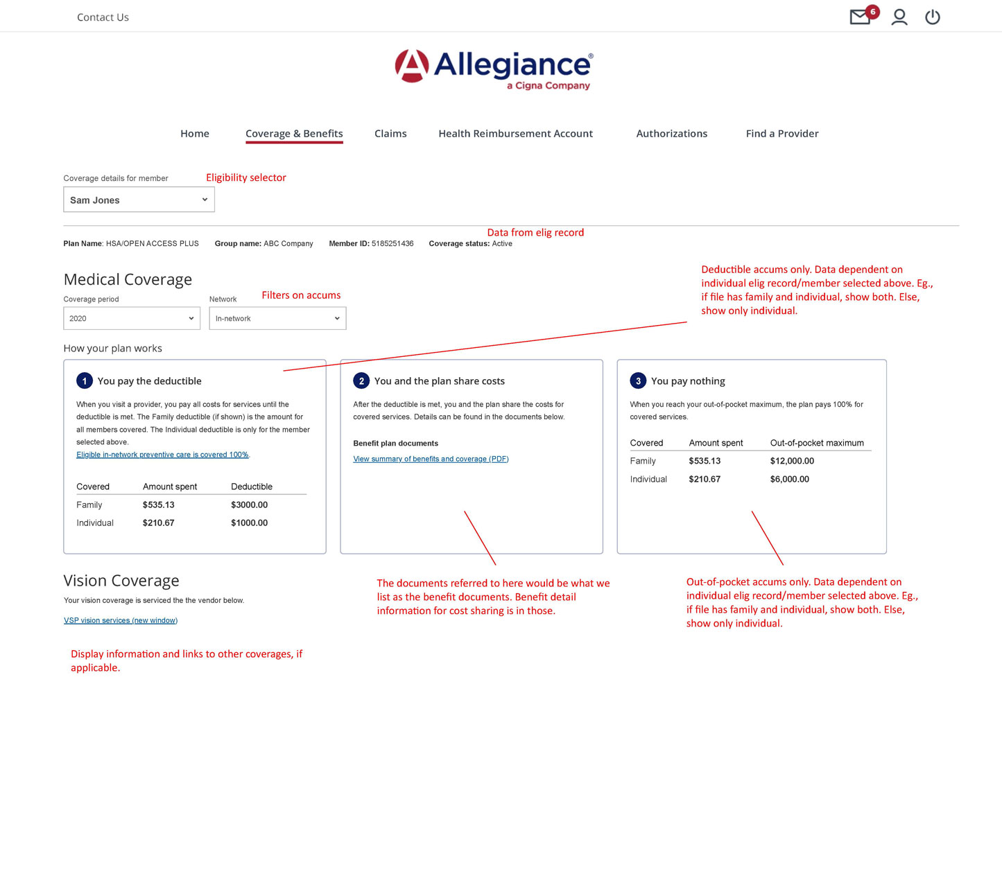
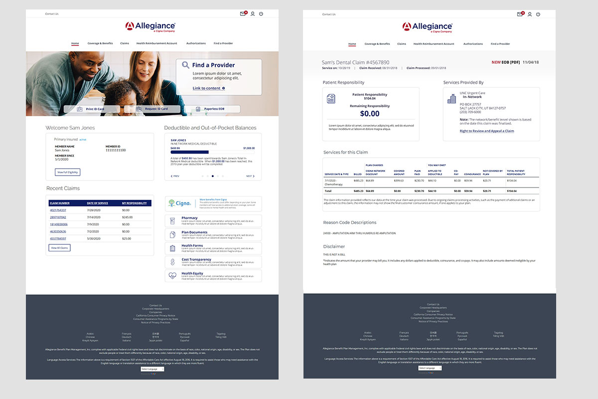
The redesign also addressed how healthcare information was presented. Instead of treating deductibles, out-of-pocket balances, coverage, and claims as undifferentiated tables, the new direction gave information a clearer hierarchy and more context. The source examples show deductible and out-of-pocket balances grouped into a dedicated section, while recent claims appear as a separate, scannable table.
The supporting UI examples also document redesign work for Coverage & Benefits and for the Deductible and Out-of-Pocket dashboard. The goal was to distill the information into something more relevant and informative for the members. A user activated carousel was proposed to show the most important and frequently used deductible first.
Present internally before presenting externally
After approximately one month of work, I presented the solution to senior management. Leadership had reserved an hour, but the direction resonated with the first fifteen minutes; with leadership expressing that we saved the project. The following day, the solution was presented to the client, whose response was very positive.
This presentation sequence was a deliberate part of the design strategy. Internal executive alignment created the organizational confidence needed to take a stronger, more coherent proposal back to a dissatisfied client.
The Results
The work produced a substantially redesigned Allegiance portal direction, including three layout options, a revised homepage and dashboard approach, improved information hierarchy, clearer member actions, and more contextualized benefits and accumulator content.
The final designs were presented first to Healthx's internal executive team. The client was very pleased with the solution. The project also led to a broader template direction that Healthx could use when working with similarly important clients.
This work also led to platform level improvements related to spacing, typography, responsiveness, SASS organization, modularity, maintainability, and code reduction. In the broader refactor comparison, the new template had 6,584 code lines verses 13,223 in previous implementations. The total lines decreasing from 17,561 to 8,492.
The Impact
The immediate impact was relational and strategic: a project that had put one of Healthx's largest client relationships at risk moved toward a positive client conversation. The work gave the client a direction that better reflected its expectations and gave Healthx an internal model for involving design earlier in major implementations.
The broader impact was organizational. The project created a new template direction for high-priority clients and demonstrated the value of bringing design into direct client discovery rather than asking design to interpret requirements after the fact. It also connected member-facing UX improvements to the underlying platform system through reusable layout, icon, styling, and SASS practices.
The most important lesson was that “make it better� in not a design brief. It is an invitation to facilitate the conversation that turns dissatisfaction into priorities. By bringing the right disciplines and the client into the same room, the team could make better decisions about hierarchy, language, context, and interaction before committing to implementation.